
If you’re still not convinced you need to optimize your online store for mobile, then let’s take a look at the latest stats.
Almost 55.5% of web traffic comes from mobile devices, and the numbers are only expected to increase.
Data from Oberlo shows one out of three people accessing the internet from their mobile devices shop online. Let that sink in.
If you’re an online store owner, it's essential for your ecommerce website to have a mobile component to avoid losing an enormous chunk of potential clients.
And if that’s not enough, you should know that Google will penalize you for not having a mobile version of your website.
The key to ecommerce success is having a mobile-first online store.
Key Elements of Mobile-Friendly Online Stores
Now that we're on the topic of optimizing mobile-friendly online stores for mobile, let's take a deep dive into the essential aspects of creating one.
Mobile-First Approach
In today's rapidly growing ecommerce landscape, achieving success means adapting to the preferences of an increasingly mobile-centric target audience.
To thrive in this environment, online retailers must embrace a mobile-first approach that prioritizes seamless shopping experiences on smartphones and tablets.
This strategy involves not only responsive design but also providing choices immediately to users to simplify their journey and enhance conversions.
Take, for instance, LeatherCult, an emerging brand in leather fashion. Specializing in leather jackets and pants for men and women, LeatherCult has ingeniously incorporated a mobile strategy that capitalizes on user preferences.
Upon landing on their website, they present users with two distinct hero sections: one tailored for men and the other for women.
This intuitive division guarantees that users can swiftly navigate to the section that aligns with their needs, streamlining their experience.

By catering to users' preferences right from the start, LeatherCult not only enhances user satisfaction but also significantly boosts conversions.
This exemplary approach showcases how catering to user preferences with immediate choices can make a profound impact on mobile ecommerce success.
Responsive Design
There are 5.3 billion internet users in the world. Out of this population, 92.3% of users access the internet from their mobile devices to:
Browse the internet
Shop from online stores
Play games
Use social media
Of those 92.3% of mobile internet users, 42% will leave a website because of poor functionality.
So, gone are the days when you could have a responsive website for desktop users only and get away with it. Now, you have to optimize your online stores for various devices.
Responsive web design refers to the functionality of web pages across different devices. It means you have a clean, easy-to-navigate, and user-friendly website for desktop users.
But it doesn’t stop there. You also need to have the same features on other devices, such as tablets, iPads, Androids, and iPhones. That way, you won't let potential clients slip through the cracks.
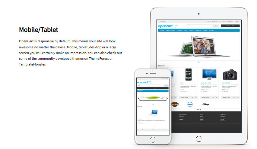
With an open-source ecommerce platform like OpenCart, you can design responsive websites without any extra heavy lifting.
Here’s how it helps:
Your site will appear stunning on all devices: mobile, tablet, desktop, or large screens
It guarantees a remarkable impression, regardless of the device being used
Explore community-developed themes on ThemeForest or TemplateMonster for more options
Page Load Speed
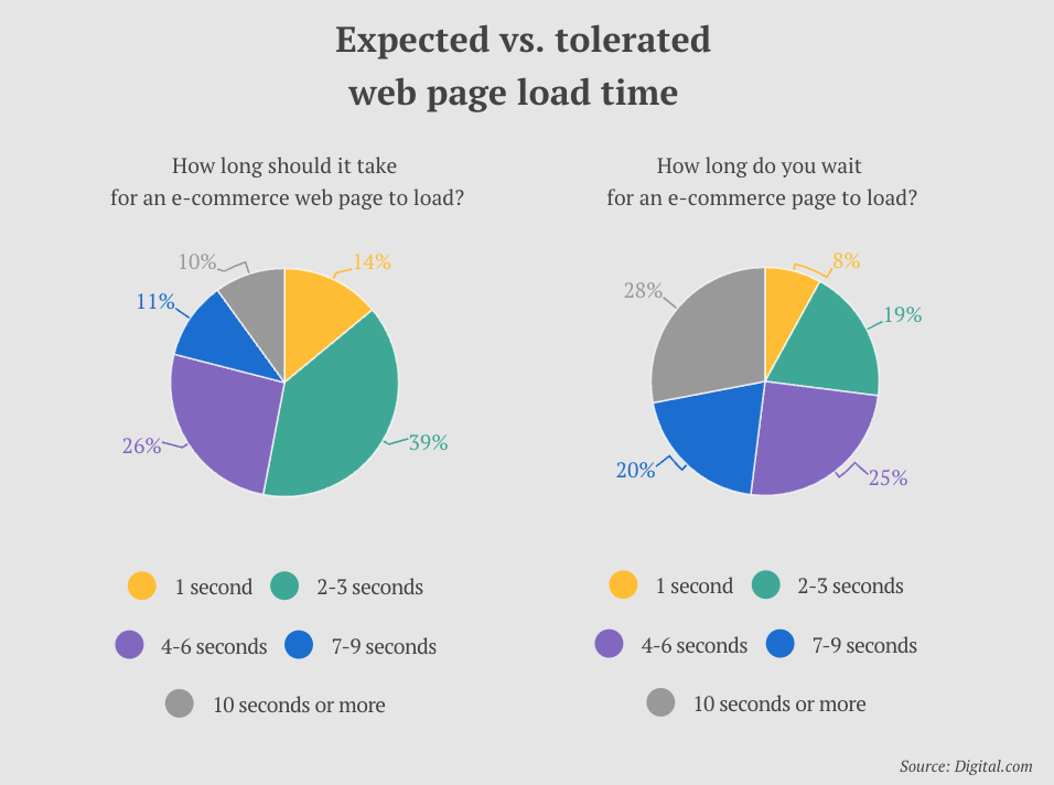
One of the most off-putting things about a website is its slow page loading speed. Even research suggests the same. As per a survey by Digital.com, one in two visitors abandon a website if it takes over six seconds to load.
If your online store doesn’t run at lightning-fast speed, you’re leaving a ton of money on the table.
Follow the steps to ensure you don’t lose money and potential customers:
Enhance images and videos for optimal performance
Minimize HTTP requests to boost loading speed
Employ a Content Delivery Network (CDN) to speed up page load times
Conduct cross-device testing to guarantee uniform fast-loading speed across all devices
A fast page load speed also helps you make a good first impression by enhancing a customer’s buying experience.
Mobile-Friendly Navigation
Clear and easy navigation is key for optimizing your online store for mobile. Buyers don’t have the time and patience to understand your online stores in detail and then shop from them.
Instead, they want things quick and easy. To convert visitors into buyers, you must follow their wants and needs.
Carrie Saunders is an ecommerce guru who has over 20 years of experience in the field. She also hosts a podcast called Ecommerce Made Easy.
In episode 10 of the podcast, “How to Optimize Your Ecommerce Site for Mobile: Boost Sales with a User-Friendly Experience,” she talks about optimizing ecommerce stores for mobiles multiple times and how to make them as user-friendly as possible.
She says, “Having a mobile website without making sure it has key components is like not having a mobile website at all. So you need to make sure it actually really works for you and your customers.”
Here’s what you can do to optimize your online store for mobile:
Simplify the website menu. Hamburger and dropdown menus are an ideal choice
Optimize logo and text size for mobile
Place a prominent search bar or search icon for users on top
Make collapsible sections to save space
Place links or calls-to-action at the bottom
Add clickable contact info (phone number and email address)
Optimizing Product Images and Videos
Images and videos affect the look and feel of your website, but they also slow down the load speed (which could eventually upset your website visitors).
To keep your customers satisfied and to optimize product images and videos on your ecommerce store, follow these steps:
Compress and optimize images to make them smaller without losing quality
Provide alt text for all images to make your online store accessible for people with disabilities
Use responsive image methods for proper scaling on diverse devices
Consider tools like TinyPNG, ImageMagick, or ImageOptim for image optimization
Alter video dimensions using tools like Blazemp and HandBrake
Stop auto-play on videos
Remove audio from voiceless videos
Instruct the developer to optimize video size for mobile
Make Scannable Font and Text Layout
People on the go don’t have the patience to go through all the web pages to find what they’re looking for. They want everything to be simple and accessible.
To achieve this, you need to make your website scannable by using the appropriate font size and clean text layout. Here are the steps you need to follow:
Use bullet points
Keep the text as minimal as possible
Break down long paragraphs into digestible bits
Be wary of the spacing between letters and paragraphs
Don’t make two web pages cling to each other. Separate them well
Use a text size that’s readable for all age groups
So, what page requires the most attention? You guessed it, your product pages.
Roughly three-quarters of US adults (76%) have purchased at least one product online using their smartphones.
This means that sales depend highly on well-optimized product pages that provide an excellent customer experience on mobile.
Hers is a great example of a brand that puts a lot of effort into creating mobile-optimized product pages. If we take a look at their page about minoxidil for women, we can see how easy it is to find information about the product and also make a purchase.

Scroll just a little further down the page and you’ll see the option to “Add to cart” is sticky, making it simple to make a purchase any time. As you scroll, Hers includes information about hair loss and the product, including helpful articles on the topics.

Following the lead of Hers to create product pages that are easy to read on mobile devices translates into easy sales and happy customers.
Mobile SEO
To bring more visitors to your online store, you need to ensure that it’s showing up in people’s search engine result pages (SERPS). The best way to accomplish the deed is by making your ecommerce store SEO-friendly for mobile.
You can ensure your website is easy to find on mobile devices by using search engine optimization (SEO) strategies specifically designed for it:
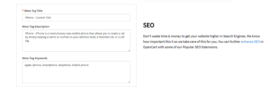
Add mobile-friendly meta tags and descriptions
Focus on local and long-tail keywords to improve your visibility in local searches
Make sure your website is properly indexed for mobile use
With OpenCart, you don’t have to worry about the SEO bit as they handle it all for you.
Minimize Pop-ups
Besides painfully slow page loading speeds, unnecessary pop-ups annoy visitors. Especially those pop-ups that are difficult to dismiss or find a close (X) button.
They obstruct a buyer’s journey and frustrate them. More often than not, visitors don’t want flash messages popping up on their faces every other second.
Plus, few of them convert, so it’s best to avoid them by all means. Instead, opt for HTML5 and think about using less obtrusive options such as slide-in overlays or modal windows.
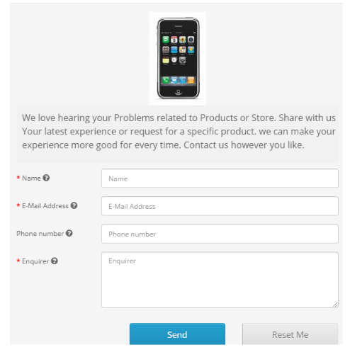
Incorporate Mobile-Friendly Forms
If you have forms on your website for securing contact information or feedback, make sure they’re optimized for mobile. Here’s what you can do to make mobile-friendly forms for your online store:
Make them easy to fill — opt for autofill wherever possible
Place clear and easy-to-read calls to action (CTAs)
Keep the forms short — less is more
Use dropdown lists for easy filling
Make sure the buttons are easy to press
Test for compatibility on different devices before going live
In case you’re looking for a solution, OpenCart allows you to create as many customizable forms as you want with ease.
Mobile Checkout
Research by Baymard Institute showed that during the past quarter, 17% of US online shoppers abandoned their purchase because of a lengthy or complex checkout process.
To increase conversions, you can reduce the friction for customers in their buying journey by following these easy steps:
Keep the checkout process short and simple
A one-page checkout is your best bet
Give customers multiple payment options
Allow customers to make purchases with a guest account
Add a progress indicator for people to know how far they've come in their purchasing journey
Place the best sellers and most sought-after products on top
Give users the option to store their payment and shipping details for future shopping transactions
Data by Hotjar reveals that 85.65% of mobile users fail to make it to checkout. Crazy, right?
By giving customers a seamless checkout process, you can boost conversions and improve customer satisfaction. It’s a win-win.
Mobile Payment Options
As you work to optimize your online store for mobile devices, it's essential to consider multiple payment options. A growing trend in the ecommerce world is the adoption of cryptocurrencies as a payment method.
Providing customers with the ability to pay using cryptocurrencies can offer a competitive edge and attract a more tech-savvy customer base.
However, it's crucial to be aware of the tax implications when accepting cryptocurrencies. Educating yourself on crypto taxes will help you navigate this ever-evolving landscape and ensure your business stays compliant.
Apart from crypto payments, you need to provide customers with multiple payment options so they don’t abandon their cart for the lack of a fitting payment method.
If you choose OpenCart, you'll get 36 payment methods that come integrated with it.

Besides offering a variety of payment gateway choices, OpenCart can also handle multiple currencies, simplifying accepting payments from international customers.
Prioritize Mobile Analytics
Leverage data as your secret weapon to uncover the successes (or failures) of your online store.
Use mobile analytics to track:
User behavior on your mobile website
Check bounce rates on your product pages
Track conversion rates and device-specific insights to make informed decisions
These analytics are a goldmine of customer insights and can be your way to improving customer journeys (thereby boosting your bottom line).
Responsive Customer Support
Make it easy to access customer support from a mobile device. Live chats with a customer service agent, AI-powered chatbots, and mobile-friendly contact forms can enhance these customer interactions.
Data from Help Scout reveals that when you provide excellent support to your customers, 93% of them come back to make future purchases. And 78% of them will continue to do business even after a mistake.
That's the power of responsive customer support, so make sure you nail it.
Test Website on Various Mobile Devices
You can’t provide customers with the best possible user experience on their mobile devices if you don't test the waters — or should I say web pages — for seamlessness.
Before you make your online store go live, test it across multiple devices such as Androids, iPhones, tabs, and laptops. For additional feedback, ask your friends to test the website, too.
Pick a few goals for your website, such as boosting newsletter subscriptions or improving the online shopping experience, and then test your website for these goals.
This way, you'll have a clear direction about what you want to test your website for and look for errors in these specific areas.
Wrapping up
By now, we must have convinced you that having a mobile-friendly website for your online store can do wonders for your business. It saves you from losing money and potential clients.
If you’ve read this far, then you must have understood it’s the little tweaks here and there that can make an enormous difference on users while shopping from your store.
By making a few changes, like allowing purchases through a guest account or having a prominent search bar, you let visitors have an intrusion-free customer journey.
The result? Your customers are more inclined to come back to you again and again (read: you’re building customer loyalty).
And if you want to get things up and running for your ecommerce business, give OpenCart a try!


Login and write down your comment.
Login my OpenCart Account